
Exploratory analysis and regression model helping fight Zika
março 2, 2017 § Deixe um comentário

Alerta Zika! was a collaborative event to explore the potential of data and technology to improve responses to the Zika virus (more information here). The Inter-American Development Bank organized it with the support of several partners including Rio de Janeiro City Hall and some major Universities based in the city. From December 2nd to 3rd 2016, about 10 registered teams explored the epidemiological, environmental and social factors to understand and explain the progress of this disease. It was one and a half day of hard work to sum up on the efforts to fight the Zika disease in Rio de Janeiro. We gain access to the dataset with all the cases of Zika, Dengue and Chikungunya registered in Rio de Janeiro city during 2015 and 2016. In order to know the data, our team started to ‘play’ with the dataset and check the variables. In doing so, we fancied about the Zika’s evolution pattern and its role during the outbreak at the early months of 2016.
Our hypothesis was that the disease propagation pattern and their correlations throughout time, city areas and weather could be used as an indicator to show where and when the disease spreads and help the city officials decide the best ways to allocate resources. We set as our goal then, to create a Rio de Janeiro map with a historical evolution of the Zika disease throughout time and temperature. During several conversations with representatives from the municipal health secretary, we wondered whether a social development indicator could provide insights about the spreading pattern. We decided to include HDI (Human Development Indicator) – known in Brazil as IDH – as a social parameter.
We then defined as our target variables the coordinates (latitude and longitude), the dates that the cases occurred, temperature over the seasons and social development indicators of Rio regarding income, education level and longevity. We set as our preliminary tasks the creation of a grid comprising the Rio de Janeiro city map and a data frame to aggregate the variables subset from different datasets. Our first goal as we performed an exploratory analysis was to explore the shape of the distributions. The grid helped us to check where the cases were located; exploring an area of about 400 meters, which is the mosquito range, as well as to cluster the patients’ cases in broader areas. It allowed us too to check how far the disease spread throughout the city and to identify the areas where most of the cases took place.
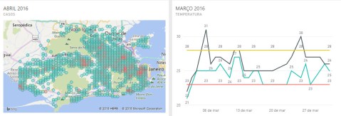
Performing a time-series analysis, we were able to identify a correlation between temperature and number of cases. In this point, to understand the mosquito life cycle is valuable. The aedes aegypti flourish in a temperature variation going from 23-Celsius degree to 28-Celsius degree (about 73 to 82-Fahrenheit). A few degrees below or above this threshold does not necessary kill the mosquito but makes the environment more uncomfortable to its development hence retarding its evolution. From the egg to inoculate the virus in an individual, there’s a 20 to 25 days period, so the previous month mosquito is responsible for the current month patient. As it can be seen at the plots bellow, comparing the disease cases through the city by month and the temperature variation per day of the previous month, the outbreak during March and April (plots 3 and 4) follows a perfect condition observed throughout February and March, where the 23 to 28-Celsius threshold was observed during most of the days. The red circles correspond to the areas with the majority of cases.
Plot 1
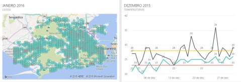
Plot 2

Plot 3
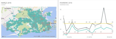
Plot 4
Plot 5

Plot 6
Plot 7

This led us to our first meaningful insight: the temperature from the previous month seems to affect the number of cases in the current month.
As we shift our attention to the social indicator data at hand, we were able to identify a curious behavior. Some critical areas during the outbreak shared a similarity of low IDH coefficient. The plot bellow provide a visual support. The orange circle sizes are relate to the level of IDH, smaller circle/lower IDH and vice-versa.
Plot 8
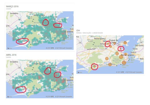
The highlighted areas on the plots above correspond to Maré (a neighborhood), the far-north zone and the far-west zone of the city. These areas share a lower level at the social indicators comparing to other parts of the municipality.
Although income seems not to be a social influence affecting the outbreak – as can be seen at the plot bellow – comparing the south zone behavior, the wealthiest part of the city, to the cases in March and April indicate, there is a peculiarity to consider. In this particular area, there is a huge economic disparity. The most exclusive addresses are placed within walking distance to some favelas (slums usually placed on hills around the area), where the IDH are similar to those on the previous plot).
Plot 9

From this observation, we draw a second meaningful insight: the social indicators (IDH) seems to count as an influence force in the areas with most number of cases during the outbreak.
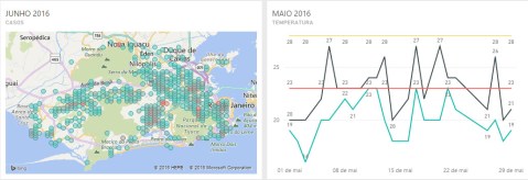
As we went further on our analysis, other curious behavior caught our attention. Even as the temperature dropped away from the 23 to 28-Celsius threshold, some areas kept appearing as the top score case holders (as it can be seen in the comparisons bellow from May to July).
Plot 10
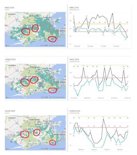
What these areas have in common is that woods and forests surround them all. This common factor provided the third meaningful insight we delivered: some recurrent disease focus areas seems to grow around or close to woods and forests areas.
Exploratory analysis usually is a good start to predictive modeling because helps to understand a little further the datasets and to summarize their main characteristics. Explore the data and formulate hypotheses that could lead to new data collection and experiments is a major component to extract usable information from data; suggest hypotheses; and support the selection of appropriate statistical tools and techniques. Our main goal at the data expedition were to set a first step that could help to understand the past behavior in order to prepare the ‘seeds’ to a future ‘crop’. Our third place award was a source of pride to ourselves and seems to indicate that this goal was accomplished.
After the Data Expedition
We continue exploring the data and aggregating other variables. Our goal was get some predictive model that could add on the initial exploratory analysis. These new variables were population per neighborhood and rainfall. We also add more data about temperature regarding the final months of 2016 and early january 2017.
The first choice was a simple linear regression using the variable population per neighborhood to predict cases based on population. Below some code chunks in R and statistical readings (we intend to show more info in a markdown file – a type of file where can be shown text, code and plots together).
The model:

A quickly view of the dataset:

“bairro” stands for neighborhood; “casos_zika” for Zika cases; and “populacao” for population.
Some statistical Reading from Rstudio console:

Diagnostic Plots
In plot 1 (Residuals vs. Fitted), at some point there’s equally spread residuals around a horizontal line, but also there are outliers. In plot 2 (Normal Q-Q) the residuals seems to be normally distributed, at least at some extend.
Plot1

Plot 2

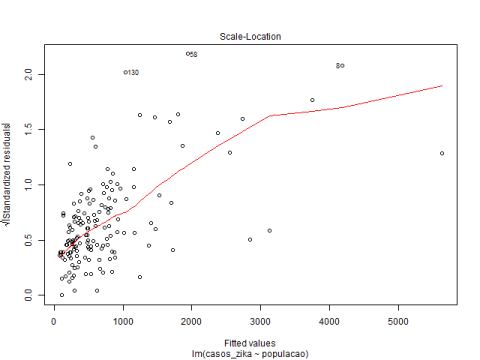
In plot 3 (Scale-Location), complementing plot 1, some residuals are spread equally along the ranges of predictors showing some homoscedasticity. Plot 4 (Residuals Vs. Leverage) identified the influential observation as #120 and #23.
Plot 3
Plot 4

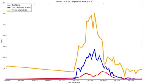
Based on the thesis that the mosquito has a faster cycle when there’s a temperature threshold between 23 and 28 degrees Celsius, we tried to check if rainfall also helps in the proliferation. Then, we tried to identify the relationship between these two variables and the number of Zika cases. Our second choice was to use a multiple regression model to meet this goal. This analysis were performed in Phython.
The chart below shows that the months with the highest incidence of the temperature threshold are those between December 2015 and April 2016. We could also notice that trend occurring again in December 2016 and early January 2017.

Green and red lines: temperature threshold
Pink and grey lines: min and max temperature
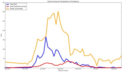
The next sequence of plots show that there is a similar positive trend between the curves showing the number of cases per week, the temperature and rainfall. The analysis was performed based on the neighborhoods of Campo Grande (1), Santa Cruz (2), and Guaratiba(3), that were severed affected during the 2016 outbreak.
Blue line: cases per week
Red line: temperature under the threshold
Yellow line: rainfall
(1)

(2)
(3)
We decided to use the multiple regression model to build a predictive application. We tested the model through a series of plots comparing the actual data with a predicted one applied in a test dataset used to fit the model.
Testing values Vs. Predicted values for Rio de Janeiro
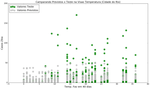
Green dots: testing values
Gray dots: predicted values
Real Cases Vs. Predicted Cases for Rio de Janeiro

Green lines: Real Cases
Gray lines: Predicted Cases
Real Cases Vs. Predicted Cases Comparison for Rio de Janeiro – december 2015 & 2016

Green: Real Cases
Gray: Predicted Cases
In this particular case (above plot) we didn’t had available the number of actual Zika cases in December 2016, so we only predicted the number of cases.
Analysis per neighborhood: Campo Grande.
Statistical Readings from Jupyter Notebook console:

Green line: real cases
Gray line: predicted cases

Analysis per neighborhood: Santa Cruz.
Statistical Readings
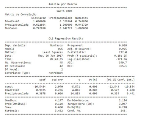
Green line: real cases
Gray line: predicted cases

Analysis per neighborhood: Guaratiba.
Statistical Readings

Green lines: testing values
Gray lines: predicted values

We created a prototype to apply the model. It’s a website with information about the number of Zika cases per month and graphics showing the actual cases and the predicted ones per neighborhood.
For those who would like to check it out, it’s available here.
