
A summarization of Rio de Janeiro’s 2018 summer
abril 13, 2018 § Deixe um comentário
This summarization is an adaptation from Edward Tufte’s illustration displayed at his “Visual Display of Quantitative Information” book. The original illustration comes from The New York Times (Fig 1).
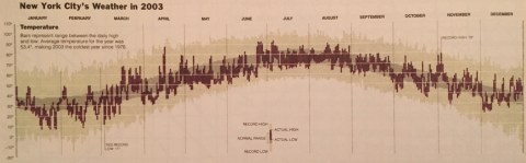
Fig 1: Edward Tufte’s illustration of New York City’s 2003 weather
Mine’s was created using R Programming packages dplyr and tidyr to preprocess and summarize a dataset collected from Average Daily Temperature archive website provided by University of Dayton.
The chart per se (Fig 2) was created using package ggplot2. Temperature is in Fahrenheit.

Fig 2: Adaptation from the original Tufte’s chart to Rio de Janeiro’s weather (summer 2018)
In my adaptation, the time series in light brown represents the average temperatures (max and min) from 1995 to 2017, while the dark brown represents the mean temperature for each day along with a 95% confidence interval.
From analyzing the chart is possible to see that from January 1st to March 20 2018, we had 34 days in Rio de Janeiro as the hottest since 1995 and 1 day as the coldest. The period represented accounts for the South Hemisphere summer.

Deixe um comentário